Designing card readiness for charging
TL;DR
To improve charging success, I redesigned the debit card experience around payment readiness rather than payment itself. I worked as the Product Designer in a cross-functional product team alongside one Product Manager, three iOS developers, and two Backend developers. Together, we identified that users frequently reached charging stations without sufficient balance, resulting in interrupted charging attempts and support requests.
The redesigned experience introduced proactive balance visibility, contextual funding flows, and charging-aware payment guidance, increasing successful top-ups by 25% while driving 68% adoption of Auto Reload.
Role
PD
Product Designer
Timeline
3
Months
Interviews
12
Users
Focus
EV
Card Payments
Understanding where charging breaks down
Before exploring solutions, I wanted to understand why users were getting blocked before or during charging. Rather than relying on assumptions, I combined quantitative product data with qualitative research to identify where the experience was failing. Product analytics showed that the biggest friction wasn't starting a session. It was recovering after users encountered a low balance.
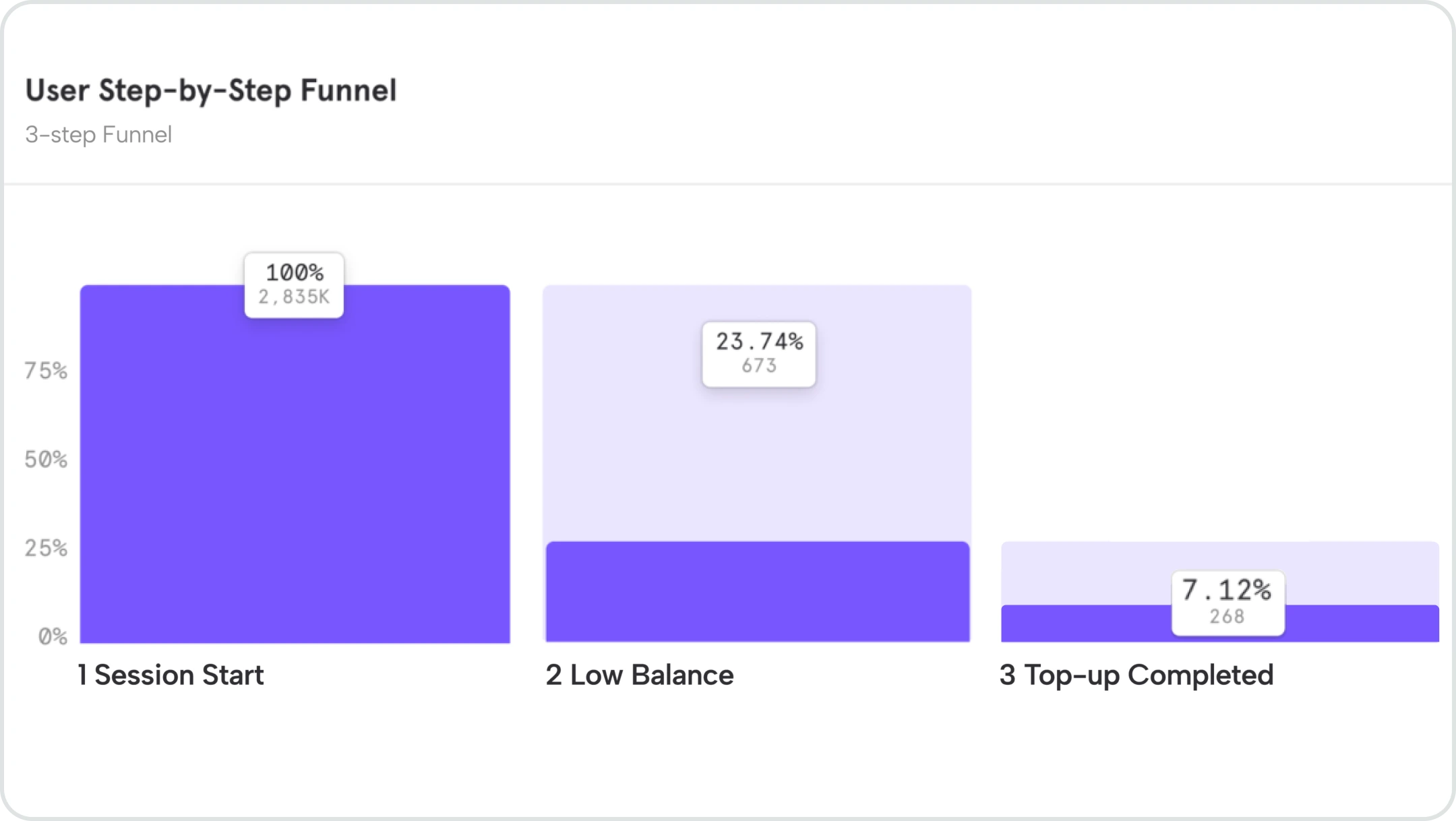
Only 9,45% of users completed a top-up after encountering a low-balance interruption, suggesting that most users abandoned the charging flow instead of recovering.
Customer Support
Support conversations revealed the same behavioural pattern. Users expected charging to start immediately and didn't anticipate that insufficient balance would interrupt the process after arriving at the station.
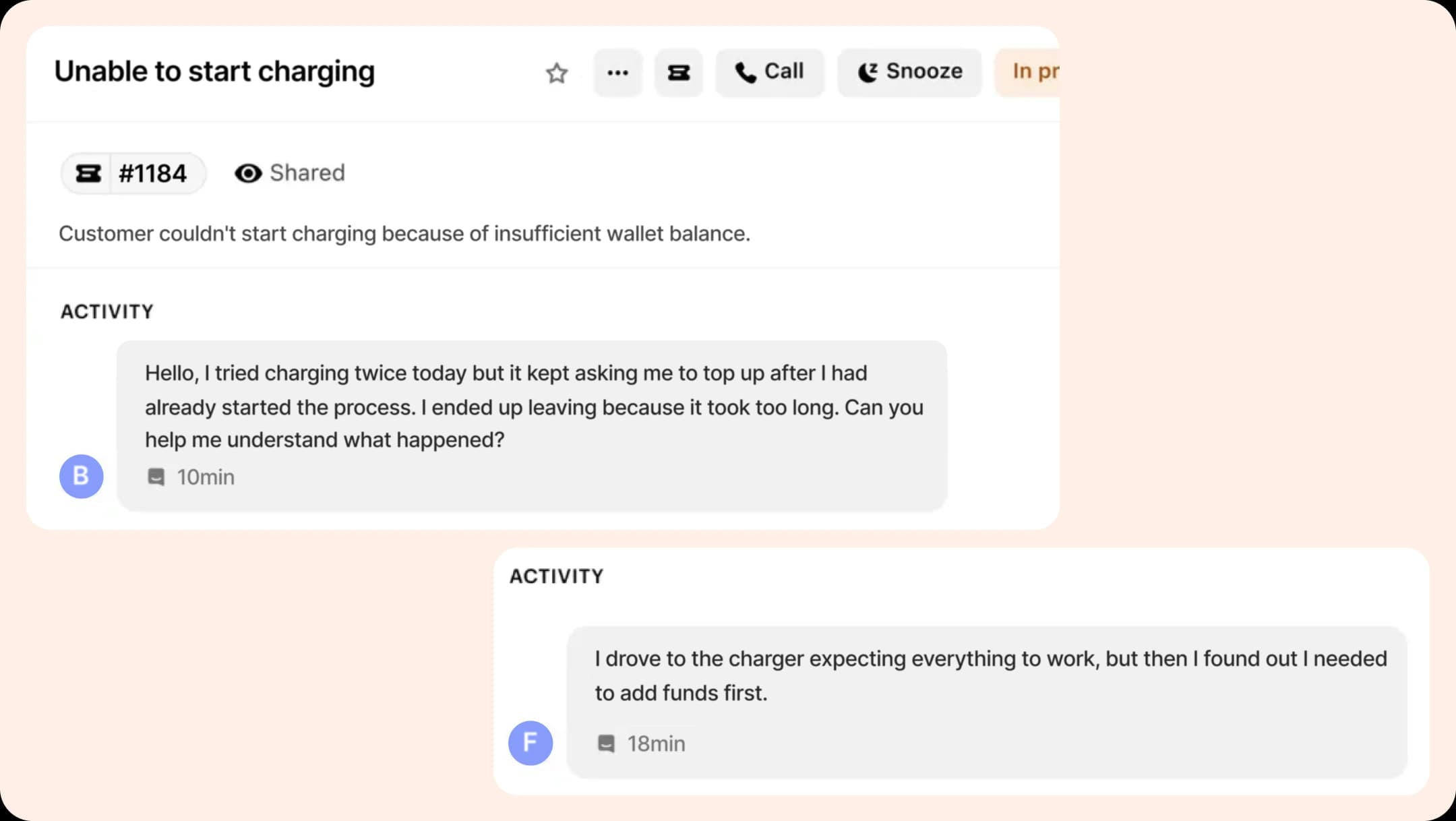
Key Insight
The issue wasn't that users couldn't top up. They didn't expect funding to become part of the charging journey. The interruption broke their mental model, causing many to abandon the flow before charging even began.
Problem: Validating the problem with users
Analytics showed where users dropped off, but not why. To understand the behaviour behind the data, I conducted user interviews with EV drivers who had recently used the charging flow.
Participants
12
EV Drivers
Method
Interview
Semi-structured
Duration
20-30
Minutes
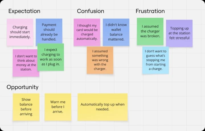
Interview findings clustered around three recurring themes: expectation mismatch, payment confusion, and recovery frustration. Participants viewed charging as a physical task rather than a payment journey, expecting it to begin immediately after plugging in. When a low balance prevented charging, many interpreted the interruption as a charger failure instead of a wallet issue.
Across interviews, users consistently asked for proactive guidance, such as balance visibility before arriving and simpler ways to recover without interrupting the charging experience.
Rather than redesigning payments from scratch, the opportunity was to redesign payment readiness throughout the charging journey.
Success Metrics
Before exploring solutions, I aligned with the Product Manager on how success would be measured. Our goal wasn't simply to optimize the payment flow. It was to help more users recover from an interrupted charging session and successfully start charging.
Primary Metric
Increase successful top-ups after a low-balance interruption. This measured whether more users could recover from an interrupted charging attempt and continue their session.
Secondary Metrics
- Increase Auto Reload adoption.
- Reduce charging abandonment.
- Reduce payment-related support tickets.
Design principles
Make payment readiness visible
Users should immediately understand whether they are ready to start charging before arriving at the station.
Keep charging uninterrupted
Design the experience to prevent charging sessions from failing because of insufficient balance.
Guide users toward recovery
Finding a charger is a high-intent task, so filtering should feel quick, clear, and easy to act on.
Automate repetitive payment tasks
Reduce manual top-ups by encouraging proactive solutions such as Auto Reload.
Helping users stay charge-ready
Instead of notifying users only after charging failed, I surfaced payment readiness earlier in the journey. A practical charging threshold helped users recognize when their balance was becoming insufficient and encouraged them to top up before it interrupted charging.
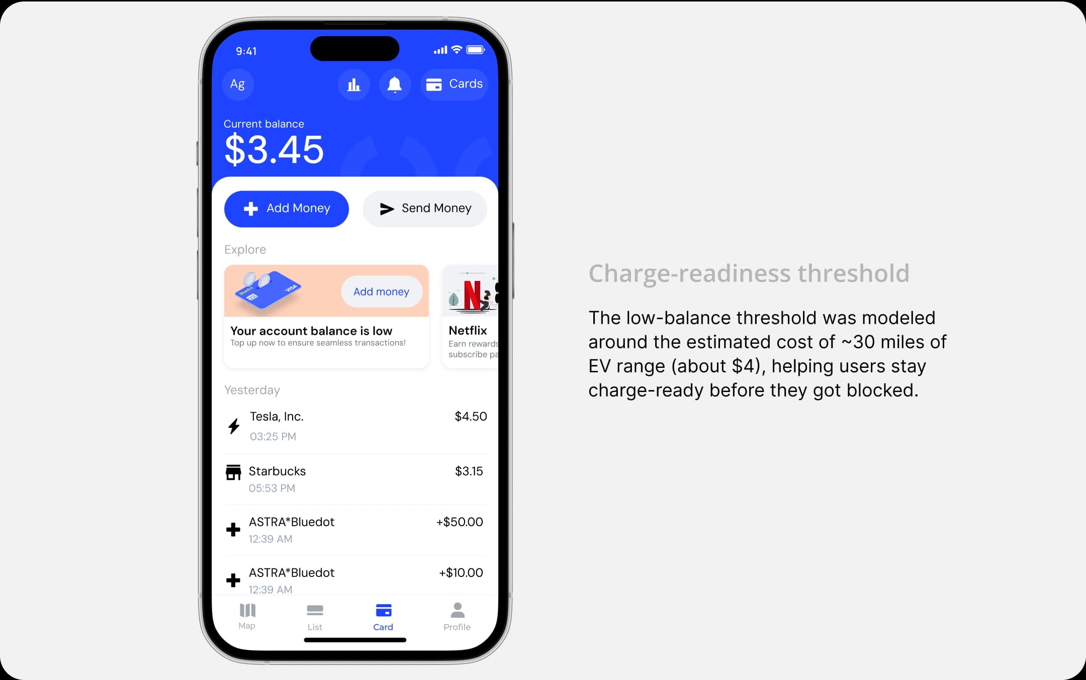
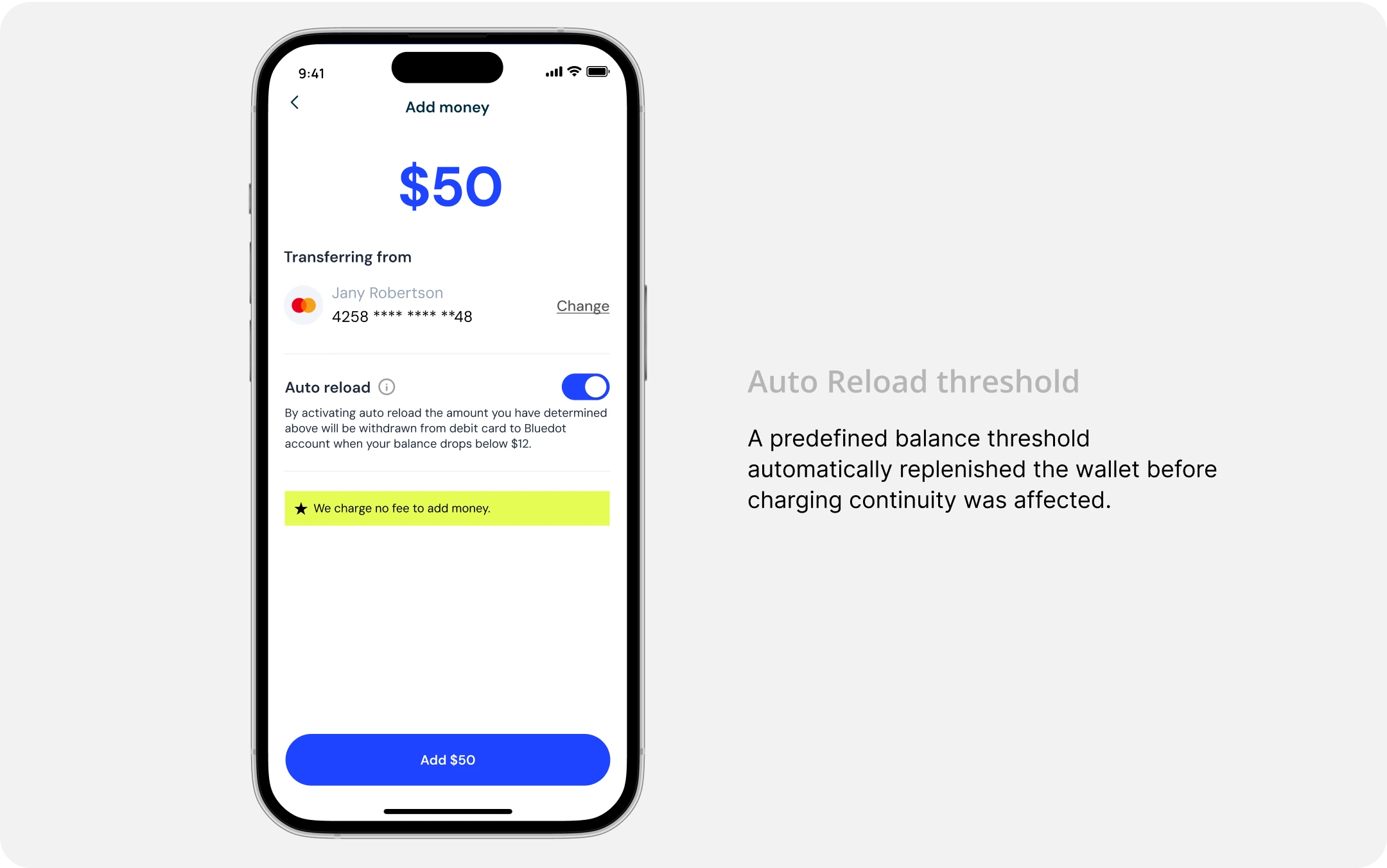
Protecting continuity while charging
Charging sessions could still fail even after they had successfully started if a user's balance became insufficient. Rather than forcing users to manually recover mid-session, I introduced Auto Reload to automatically replenish their wallet from a linked debit card, helping charging continue without interruption.
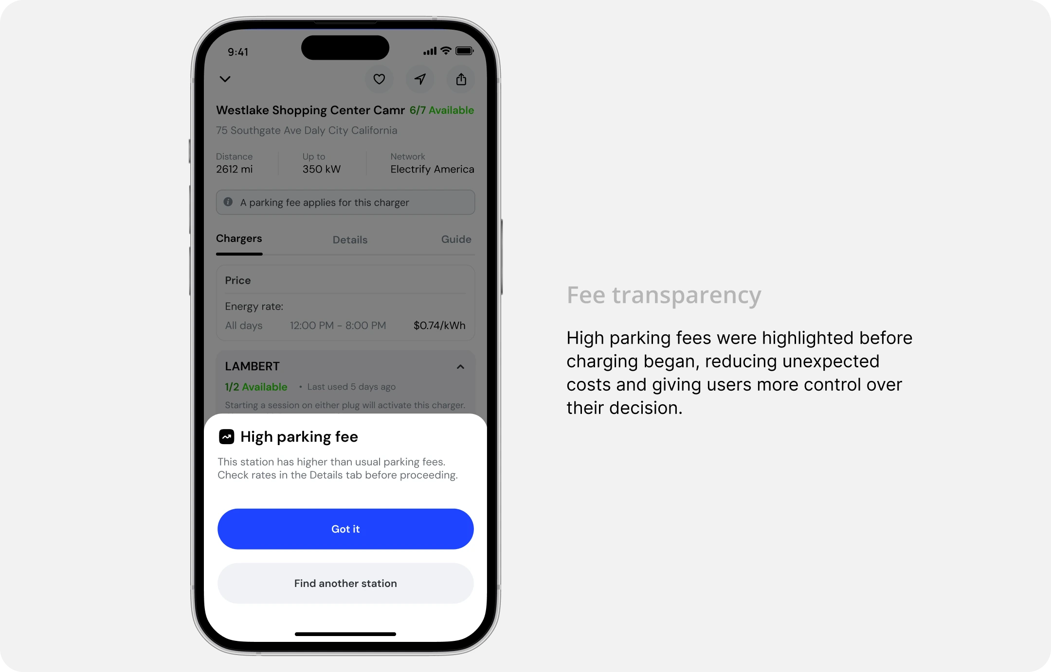
Making unexpected fees easier to understand
Some charging stations included unusually high parking or idle fees that users only discovered moments before charging. I surfaced these exceptional costs upfront, giving users the context they needed to continue with confidence or choose another station before committing.
Results
The redesign shifted the experience from reacting to payment failures to helping users stay charge-ready. After launch, we measured both behavioral changes and qualitative feedback to understand the impact.
25%
Fewer charging sessions hit a low balance after launch based on Mixpanel funnel analysis
68%
Auto reload adoption among users who added money with a linked debit card.
User feedback
“...It’s helpful that the app handles it before it becomes a problem.”
“It’s nice not having to worry about my balance right when I’m about to charge.”
Beyond improving conversion, the redesign changed when users thought about payment. Instead of discovering balance issues at the charger, they were able to prepare earlier and complete charging with fewer interruptions.
Impact & Retrospective
Looking back, the biggest lesson was that successful charging starts long before a user plugs in. Rather than optimizing a payment flow in isolation, we redesigned the experience around readiness, making balance visible earlier, guiding the next best action, and protecting charging continuity. This approach not only improved key product metrics but also created an experience that better matched users' expectations.